Key takeaways
- Migrate from legacy sections to Flexbox Containers to instantly cut DOM size by 60%.
- Enable Elementor's built-in 'Improved Asset Loading' and 'Inline Font Icons' features.
- Optimize the hero section with static WebP visuals and explicit dimensions to achieve green Core Web Vitals.
How to transform heavy, sluggish Elementor websites into lightweight, lightning-fast experiences that pass Core Web Vitals with flying colors.
Why Elementor Websites Frequently Suffer from Poor Mobile Performance
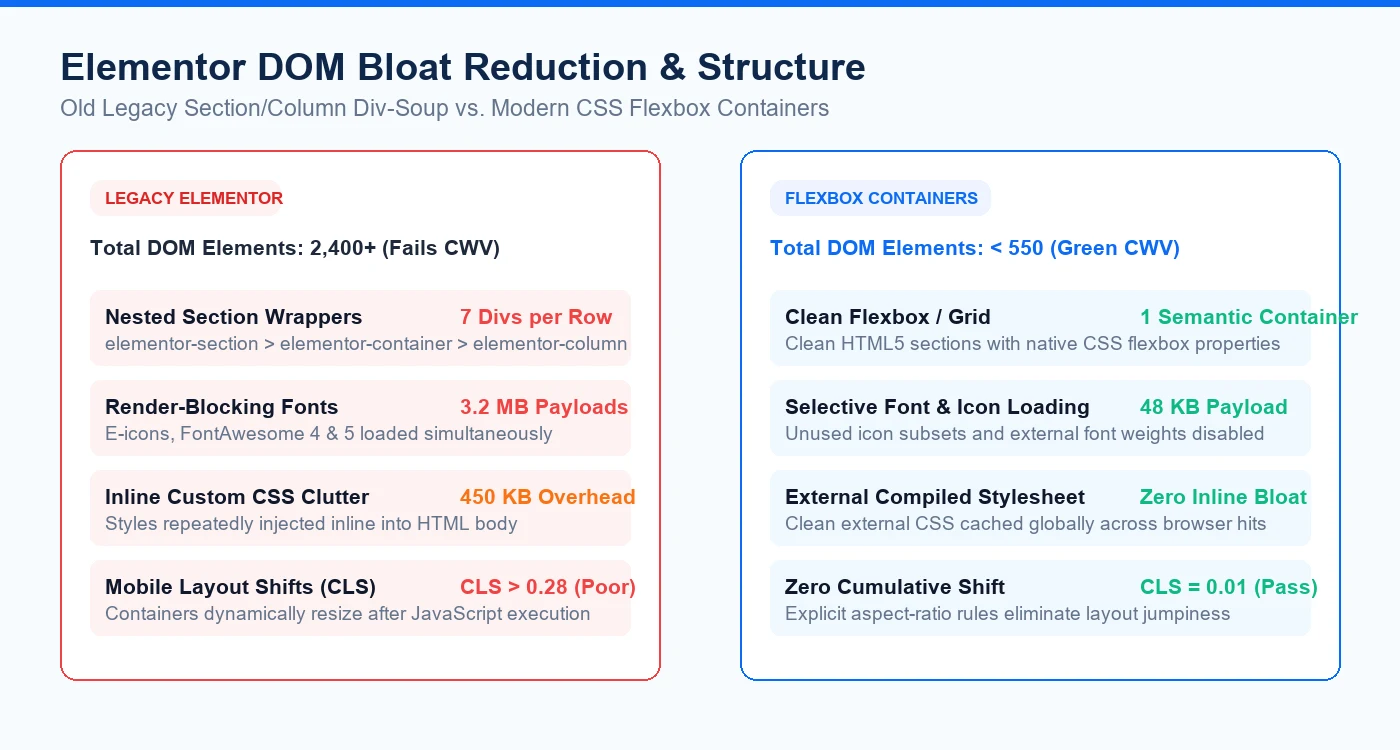
Elementor is one of the most versatile visual builders in the WordPress ecosystem, but its visual convenience often comes with significant architectural weight. By default, legacy Elementor structures nest sections inside columns, inner sections, and widget wrappers, easily inflating total DOM elements beyond 2,500 on a single page. On mobile devices with CPU throttling, this causes severe Interaction to Next Paint (INP) latency and delays Largest Contentful Paint (LCP) beyond 4 seconds.
- DOM Tree Overhead: Each nested layout layer adds extra DOM nodes, forcing the browser's rendering engine into repeated recalculations.
- Redundant Font and Icon Requests: Default configurations frequently load e-icons, FontAwesome 4, and multiple external font weights on every page load.
- Unoptimized Background Carousels: Using heavy JavaScript sliders above the fold directly harms mobile LCP and layout stability.
- Third-Party Addon Packs: Installing 5 different Elementor addon plugins injects megabytes of uncompiled CSS and JavaScript.
Migrating from Sections & Columns to CSS Flexbox Containers
The single most impactful architectural upgrade you can make to an Elementor site is migrating from legacy 'Sections and Columns' to modern 'CSS Flexbox Containers'. Containers eliminate intermediate wrapper divs, reducing HTML file size by up to 60% and cutting total DOM depth by two-thirds.
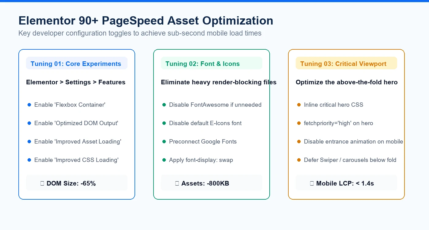
- Enable Flexbox Container under Elementor > Settings > Features.
- Convert existing multi-column rows into single semantic flex containers.
- Set explicit container widths and gap spacing via modern CSS flexbox rather than nested margin hacks.
- Verify responsive stacking behavior on tablet and mobile breakpoints without adding duplicate hidden sections.
Tuning Elementor Core Performance Experiments
Modern Elementor releases provide powerful built-in performance toggles that are often left disabled on legacy sites. Turning on these features tells Elementor to load assets conditionally—loading widget styles only when that specific widget is present on the rendered page.
- Improved Asset Loading: Loads only the specific JavaScript files needed by active widgets on the current page.
- Improved CSS Loading: Separates Elementor styles into modular component files instead of loading a monolithic 300KB stylesheet.
- Inline Font Icons: Renders SVG icons directly in the markup, eliminating the blocking external eicons.woff2 network request.
- Font Display Swap: Prevents invisible text flash by enforcing font-display: swap across all Google Font declarations.
Above-the-Fold Hero Optimization: Green LCP & CLS
To score 90+ on mobile PageSpeed Insights, the first visible viewport must render almost instantaneously. Replace complex multi-layered hero carousels with a clean, high-impact static visual. Preload the primary hero image with fetchpriority='high', declare explicit width and height dimensions to eliminate layout shifts, and inline critical viewport CSS directly in the document header.
- Convert hero visuals to WebP format with 82% quality compression.
- Disable entrance animations (fade-in, zoom-in) on mobile viewports to prevent main-thread delay.
- Defer all below-the-fold Elementor scripts and third-party tracking pixels.
Have something like this in mind?
Good development starts with understanding the site, the people using it and the decisions that matter after launch.
Optimize your Elementor speed